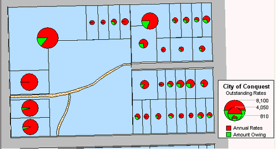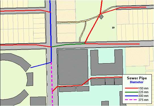
The different types of thematic maps are as follows:
•Individual Values Map
•Ranged Values Map
•Graduated Symbols Map
•Dot Density Map
•Bar Chart Map
•Pie Chart Map
Individual Values Map
Individual Values maps show points, lines, or boundaries that are shaded by individual values contained in a particular field. You can use both numerical and nominal values in individual values maps. Conquest Map gives each unique value its own colour or symbol. When an individual values map uses symbol types, the symbols are taken from the default style of the map.
If you are shading your points, lines or boundaries using nominal data, you can shade only by individual values. Nominal data is either non-numerical data (text strings) or numeric data where the numbers represent non-numeric data like an ID number. Dates are considered numeric data and can be used in both ranged and individual values maps.

Ranged Values Map
When you create a ranged thematic map, Conquest Map groups all records into ranges and assigns each record’s object the colour, symbol, or line for its corresponding range. For example, shading properties according to their area.
With the Ranged map feature, Conquest Map groups the area of each property into ranges. All records are assigned to a range and then assigned a colour based on that range.
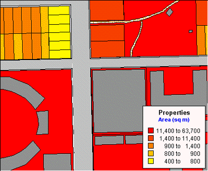
Ranged Map – Natural Break
Graduated Symbols Map
Graduated symbol maps use symbols to represent different values. You can use graduated symbols regardless of the type of map object with which you are working.
When you select the graduated symbols option, Conquest Map varies the size of each symbol according to the value in the selected field.
Graduated symbols maps work best when you use numeric data. If you are working with a layer of restaurants, it makes no sense to create graduated symbols based on the type of cuisine each restaurant serves. However, graduated symbols are appropriate when you want to show the number of hamburgers sold at 20 different fast food restaurants.
There are three attributes you can customize on a graduated symbols map: the colour, type, and size of the symbol.
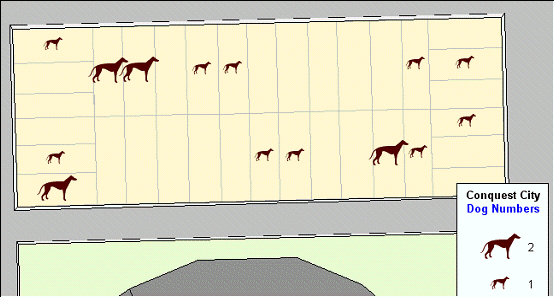
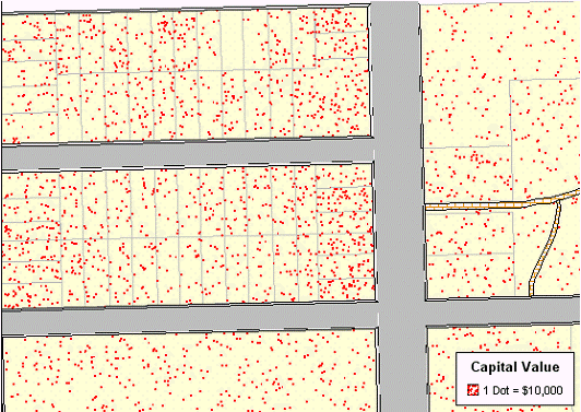
Dot Density Map
Dot density maps use dots to represent the data value associated with a boundary or region. The total number of dots in a region represents that region’s data value. If you have 10,000 senior citizens in a county, and each dot represents 100 senior citizens, there would be 100 dots in the county boundary.
Dot density is particularly useful for showing raw data where one dot represents a large number of something: population, number of fast food restaurants, number of distributors who carry a brand of soda, etc.
When you increase the value each dot represents, you decrease the number of dots that display on the map.
A second option is to change the size of the dots according to your needs, either large or small. If you are working with large populations, or large counts of something, make the dot size smaller so that the distribution of dots is easier to see. Conversely, if your working with a small data set, making the dot size larger might illustrate your analysis more clearly. Distribution of dots is random within the region.
Thirdly, in the Customize Dot Density Settings dialog, change the colour of the dot to either red or black to add more variety to the final map. You can create multiple dot density maps on the same layer by varying these options.
Bar Chart Map
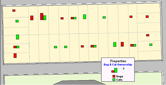
Unlike thematic maps for single variables such as ranges of values or graduated symbols, a thematic bar chart map allows you to examine more than one variable per record at a time. A bar chart is built for every map object at the centroid of the object, enabling you to analyse the thematic variables in a particular chart by comparing the height of the bars. You can also examine the same variable across all the charts in your map.
You can customize the colour of each bar, create a frame around each chart, and fill the empty space inside the frame with a pattern or colour. In addition, you can change the bar chart’s orientation, such as displaying horizontal bars instead of vertical (the default). You can also control where to display the chart: over the object’s centroid (the default) or any of eight other locations.
You can also display a multi-bar chart, where each thematic variable has its own bar, or a stacked bar chart with each thematic variable on top of one another, or a graduated bar chart, where the bars are graduated in size based on some value. You can also scale the bars in a multi-bar chart independently from one another. To show negative values in a bar chart map, the bars extend in the opposite direction to the chart’s orientation. Note that negative values do not display in stacked bar charts.
Pie Chart Map
Thematic mapping using pie charts also enables you to examine more than one variable per record at a time. Like comparing the height of the bars in bar charts, in pie charts you compare the wedges in a single pie, or examine a particular pie wedge across all of the pies. Pie charts also enable you to compare parts of a whole.
For best results, use no more than four to six pie wedges per pie chart in your analysis.
You can customize the colour of each pie wedge as well as the borders of the wedges and the whole pie. You can also specify the angle at which you want to place the first pie wedge, and whether the variables go in a clockwise or counter clockwise direction. Like bar charts, you can also change the pie’s orientation. The default is to place the pie over the centroid of the object.
You can choose from graduated pies or half pies. Graduated pies will graduate the size of the pies according to the sum of their components. With half pies your data will be distributed across half a pie instead of a whole pie.
